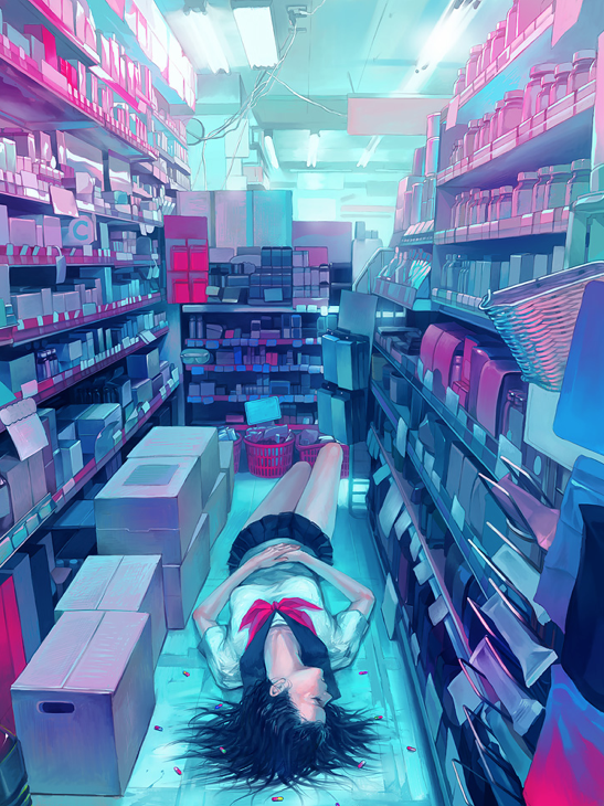
Their pieces remind me of the fish eye lens effect. I like how the artist uses continuation of color scheme throughout a few different pieces, and their style is so distinctively intricate but at the same time soft and simple.
Hello yes this is she, digital foundations blog at your service, for your (and the teacher's) entertainment. Call me beep me if you wanna reach me.
Tuesday, March 18, 2014
Let's find the thing: Zain7
Zain7 is the last digital artist I'll post about for now. Their work really caught my eye due to the brilliance of the colors used and the surreal sense of perspective that their pieces give.
Let's find the thing: Nikita Veprikov
Nikita Veprikov is a Russian digital artist, and you may recognize his work in his piece of an old witch, Old Hag.
This is the piece that originally drew me to him, having found it on Tumblr and read the resulting story that was written in companion to this piece. I love how Veprikov conveys emotion and a sense of reality in an otherwise fantasy scene.
This style of artwork is something I'd love to try my hand at. I love illustration, although I'm not the biggest fan of creating digital art myself, but it would be interesting to try.
Let's find the thing: Mistywisp
Mistywisp, a fractal artist, uses technology to create fascinating geometric fractal art. Fractal Art is a form of algorithmic art that is created by calculating fractal objects and representing these calculations as images. The designs created from this can be similar in appearance to mandalas. Fractal art is one of my favorite styles of digital art. I've been a math nerd for years, so anything geometric has always spiked my interest.
When we were first experimenting with Adobe Illustrator, I had a lot of fun with the solar flares. This kind of art strikes a similar chord in me, and I'd enjoy finding out how to make these and incorporate them into illustrative designs.
Let's find the thing: Alberto Seveso
Another one of my favorite digital artists is Alberto Seveso. I found his work during my research, and I was just taken by his combination of portraiture and abstract designs.
I really like the way that he combines organic shapes that are such vibrant colors with the soft skin tones of the woman. His inclusion of line gives the face more texture and depth, and provides a third component to the piece that balances the photo like details of the face and the bright organic shapes.
I would love to find out how he layers the different components of this piece.
Project Passable Papery Papercraft
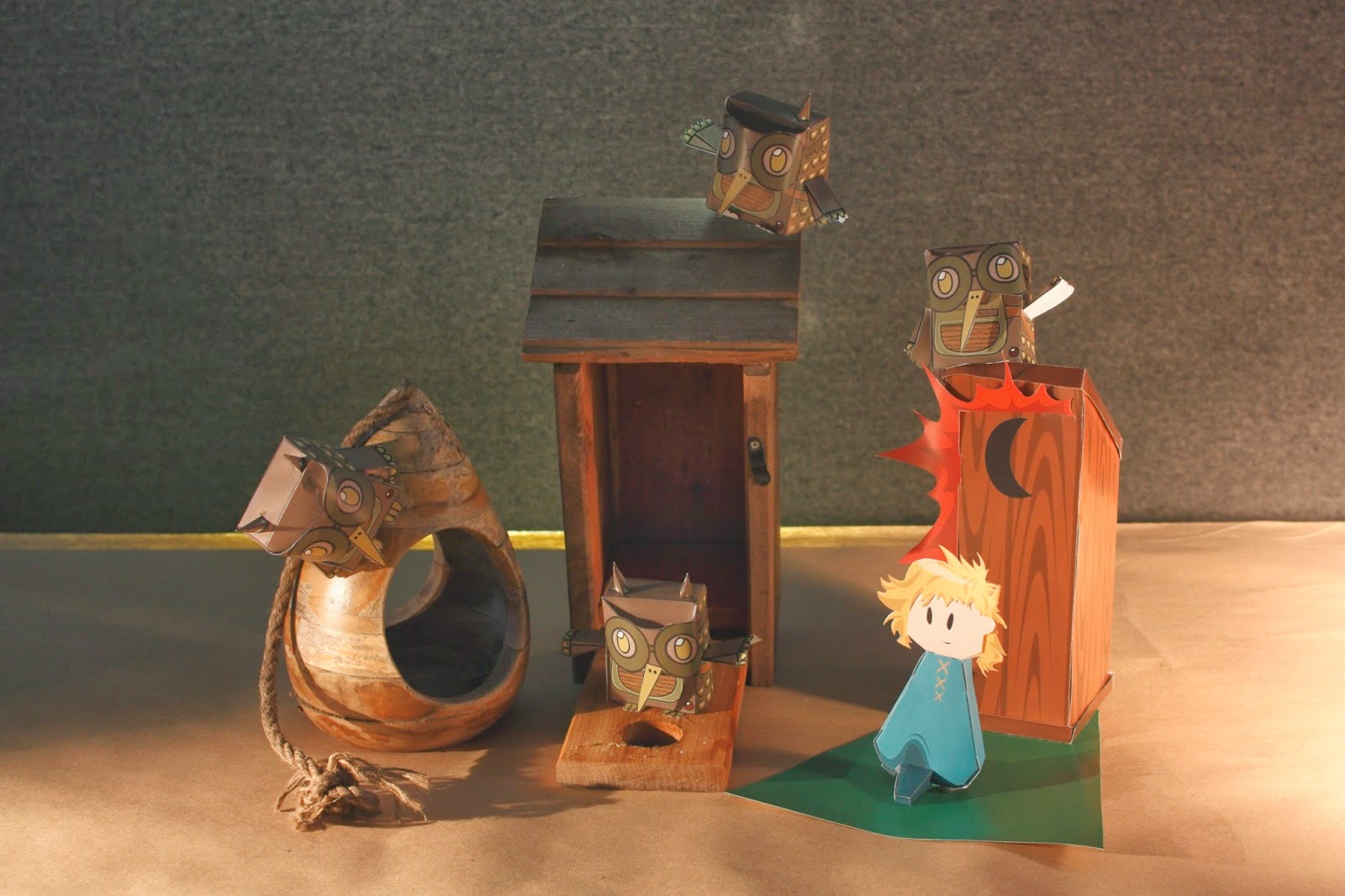
The third Project in my digital foundations class was actually less digital than expected. We were doing paper craft projects. However, we had to be original in our construction and layout of our figures. After some research and practice on how to put together a 3D paper object, I tried my own hand at designing a character template. But before I could start on that, I needed to come up with an idea. Unsure of wether or not I wanted to do an original humanoid character or to design a template for an animal, I started my brainstorming in my sketchbook, going through a few different character designs and exploring multiple scenarios. I knew that I wanted to design a specific scene however.
(above: possible character designs. below: end design)
After I settled on a design, I then went on to make a mock up model. Instead of relying on pre-existing designs, I started from scratch, making my templates piece by piece.
From here I dismantled my model and scanned the flattened pieces into the computer before importing them into Adobe Illustrator. Then, I worked out a color scheme using this website. I then made a base outline in Illustrator, and from there I used the colors I had chosen to design the specifics of my character.
This was the end result:
Let's find the thing: Noelle Stevenson; Gingerhaze
Having spent the first half of the semester on Adobe Illustrator, we're now moving on to Photoshop! Woohoo! So, in preparation, we've been tasked to find five photoshop artists and write about them a little.
The first person I think of when I think photoshop artists is Noelle Stevenson, or as she is more commonly known online; Gingerhaze. Gingerhaze is a digital comic artist, probably best known for her drawings of The Broship of the Rings, a parody of The Lord of the Rings in which the characters are all drawn as modern day people.
The first person I think of when I think photoshop artists is Noelle Stevenson, or as she is more commonly known online; Gingerhaze. Gingerhaze is a digital comic artist, probably best known for her drawings of The Broship of the Rings, a parody of The Lord of the Rings in which the characters are all drawn as modern day people.
(Photo from Gingerhaze)
I was first attracted to this artist because of the subject matter and the simplicity with which she draws her characters. The very flat colors with little shading strike me as minimalist without taking away too many details. Gingerhaze also has done illustrations as well as comics, an example being a cover she did for Random House's Listening Library audio edition of The Time Machine:
(Photo from Gingerhaze)
From this artist I hope to learn how to portray a scene without using too many details. I'd like to try my own hand at making illustrations and comics using photoshop and purely digital means.
Stop Taking Our Damn Books
If there's one thing that really fires up my bases, its the topic of banned books. Why would you ban books? Books are wonderful things, things of knowledge and wonder and magic. Growing up, I was in trouble a lot, but the one thing my parents swore never to take from me was my books. Books are just so important, and banning books is one of the stupidest things I can imagine happening. Either way, it happens.
People also seem to not be very aware of banned books. It's not really a topic that enrages people (even though it should) or captures people's attention. So when we were given instruction to design something for any issue we wanted, I knew that banned books was the one.
After having chosen my issue, I had to come up with a way to portray it. I knew I didn't want to do something cliche such as books with chains around them. I started with researching lists of banned books. But the list of banned books is massive. Name a classic, and it's most likely been banned somewhere. So I had to narrow it down. I went with banned books that I had read myself. Well, that narrowed it down some, but it was still a pretty large list. I started brainstorming key symbols and images from each book, and ended up with another list, but of images. After that I worked on incorporating as many as I could into a scene. Eventually I ended up with this:
(version one)
In this first version, I only managed to incorporate three different banned books, only one of which was easily identifiable. The leaves and tree are supposed to represent both Leaves of Grass and Gone with the Wind, while the girl is supposed to Alice, and therefore Alice's Adventures in Wonderland.
I fixed a couple things, such as the background color and I added a bright red letter "A" to Alice's dress to symbolize A Scarlett Letter by Nathaniel Hawthorne. In the end I had two copies, one kid friendly and another uncensored one.
(above: Kid friendly. below: uncensored)
Subscribe to:
Comments (Atom)


